
Meta keeps nudging Facebook and Instagram toward taller, mobile-first creative, and 2026 is the year that shift became the default rather than the exception. Instagram moved its profile grid to a 3:4 preview, Meta unified Stories and Reels into a single 9:16 safe zone, and the ad platform now recommends a higher 1440px resolution for crisp display on modern phones. If your templates still assume square-everything, this guide gets you current.
Below are the image sizes that matter across Facebook, Instagram, and Meta Ads for 2026, plus the design rules that keep your content from getting cropped or covered by interface elements.
Think of this as your working reference for meta post sizes in 2026 — every recommended dimension in pixels, the aspect ratio behind it, and the file-size and format rules that keep photos sharp. Bookmark it, or skip to the quick-reference table when you just need a number.
The one-minute summary
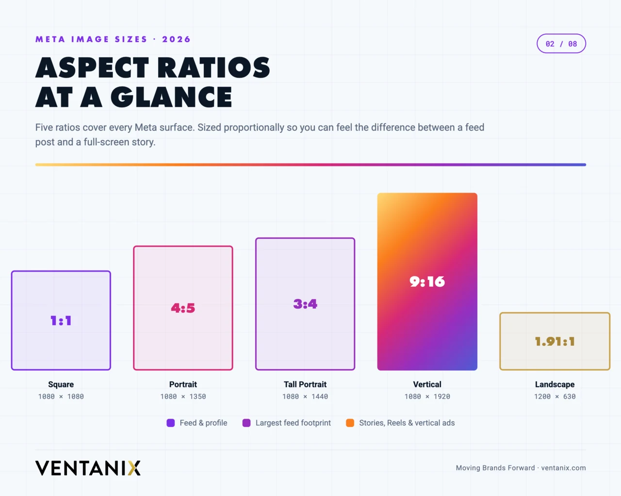
If you only remember three numbers, make them these: 1080 × 1350 (4:5 portrait) for feed posts, 1080 × 1920 (9:16) for Stories and Reels, and 1200 × 630 (1.91:1) for shared link previews. Build everything else around those, design for vertical first, and keep important content centered.
Every meta post size at a glance (2026 quick reference)
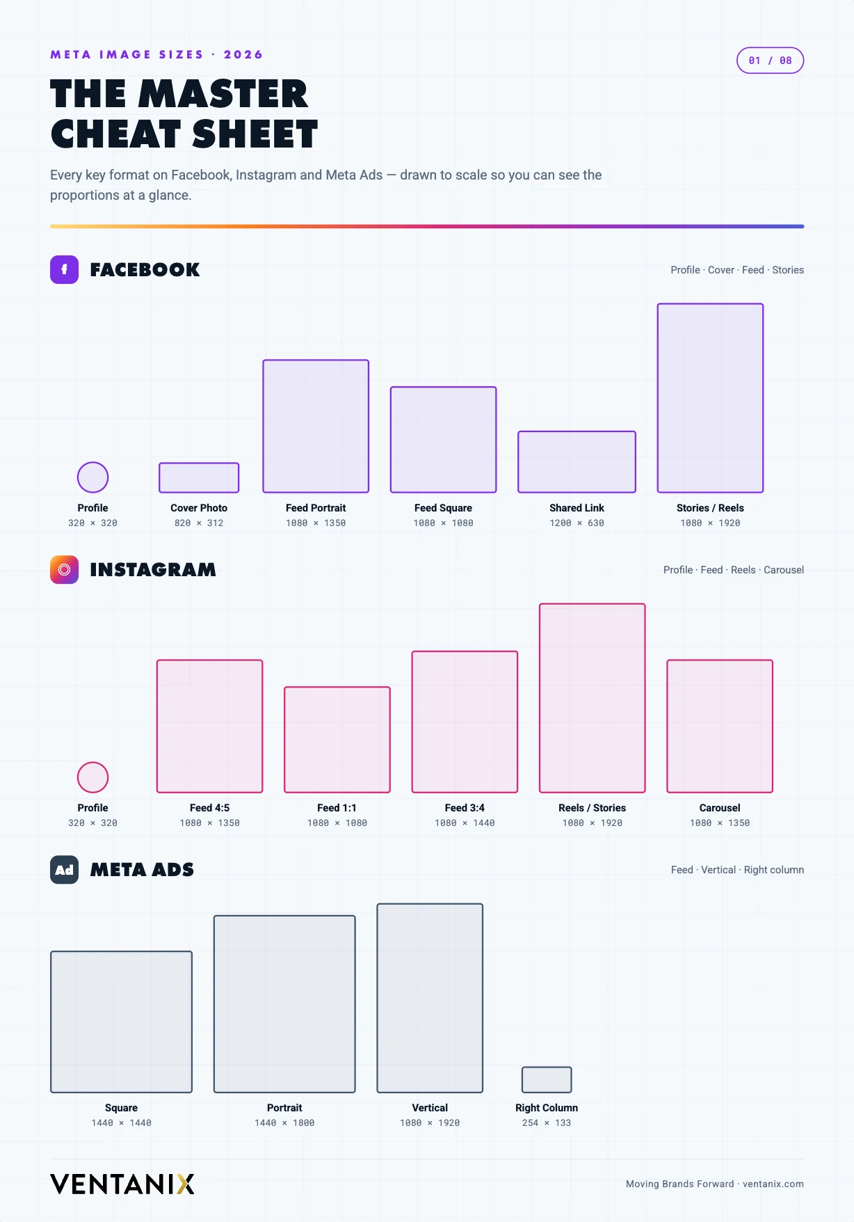
Here is the whole picture in one place. This master table lists the recommended size in pixels, the aspect ratio, and the maximum file size for every common Facebook, Instagram, and Meta Ads placement. When you need a single source of truth for meta post sizes, start here and drop to the platform sections below for the nuance.
| Placement | Recommended size (px) | Aspect ratio | Max file size |
|---|---|---|---|
| Facebook / Instagram feed — portrait | 1080 × 1350 | 4:5 | 30 MB |
| Facebook / Instagram feed — square | 1080 × 1080 | 1:1 | 30 MB |
| Instagram feed — 3:4 (new) | 1080 × 1440 | 3:4 | 30 MB |
| Feed — landscape / link preview | 1200 × 630 | 1.91:1 | 30 MB |
| Stories & Reels (all four surfaces) | 1080 × 1920 | 9:16 | 30 MB image / 4 GB video |
| Facebook profile picture | 320 × 320 (min 196 × 196) | 1:1 | — |
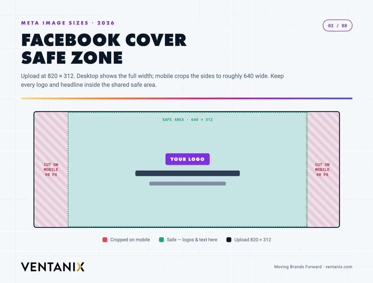
| Facebook cover photo | 820 × 312 | ~2.6:1 | — |
| Meta Ads feed — square (high-res) | 1440 × 1440 | 1:1 | 30 MB |
| Meta Ads feed — vertical (high-res) | 1440 × 1800 | 4:5 | 30 MB |
| Carousel slide (match all slides) | 1080 × 1080 or 1080 × 1350 | 1:1 or 4:5 | 30 MB |
Every dimension above is safe to build against today. The rest of this guide explains when to reach for each one, where platform UI eats into your creative, and how to keep file sizes down without visibly softening the image.
Why getting your meta post size right matters
Using the correct dimensions is not a cosmetic detail — it changes how far your content reaches and how professional it looks. Three things happen when a post is the right size. First, it fills the frame: a 4:5 portrait occupies far more of a scrolling feed than a square, and more screen space means more time before your post scrolls out of view. Second, nothing important gets cropped or covered: platform UI — usernames, captions, CTA buttons — sits on top of your creative, and a correctly composed image keeps faces, logos, and text out of those danger zones. Third, on paid campaigns, supplying a properly sized asset for each placement lets Meta’s delivery system show your ad everywhere instead of skipping placements it can’t fill cleanly, which widens reach and usually lowers cost per result.
The reverse is just as real. Upload a square where the feed expects a portrait and you surrender vertical space to competitors. Let a headline drift into the bottom third of a Story and the CTA button hides it. Hand the ad system a single 1:1 file and it may decline to run your Reels placement at all. Right-sizing is the cheapest performance lever you have — it costs nothing but a correct export.
Facebook post sizes for 2026
Facebook still mixes square, portrait, and landscape, but vertical creative now earns more screen real estate in the feed. Use these dimensions:
| Placement | Recommended size (px) | Aspect ratio |
|---|---|---|
| Profile picture | 320 × 320 (min 196 × 196) | 1:1 (displays as circle) |
| Cover photo (desktop) | 820 × 312 | ~2.6:1 |
| Cover photo (mobile display) | 640 × 360 | 16:9 |
| Feed post — portrait | 1080 × 1350 | 4:5 |
| Feed post — square | 1080 × 1080 | 1:1 |
| Feed post — landscape | 1200 × 630 | 1.91:1 |
| Shared link preview (Open Graph) | 1200 × 630 | 1.91:1 |
| Event cover | 1920 × 1005 | 1.91:1 |
| Group cover | 1640 × 856 | 1.91:1 |
| Stories | 1080 × 1920 | 9:16 |
| Reels | 1080 × 1920 | 9:16 |
The cover photo is the trickiest because Facebook crops it differently on desktop and mobile. Upload at 820 × 312, but keep your logo and key text inside the central area that survives both crops — roughly the middle 640 × 312 region.
Two placements catch people out. Shared link previews pull their image from your page’s Open Graph tag, not from an upload — so if a link looks wrong in the feed, the fix is the 1200 × 630 OG image on the destination page, not Facebook. And event and group covers render at a wide 1.91:1 on desktop but crop tighter on mobile, so treat the centre third as your only guaranteed-visible zone. For everyday posting, the 4:5 portrait feed post is your workhorse: it occupies the most vertical space a Facebook feed post is allowed before the platform crops it.
Instagram post sizes for 2026
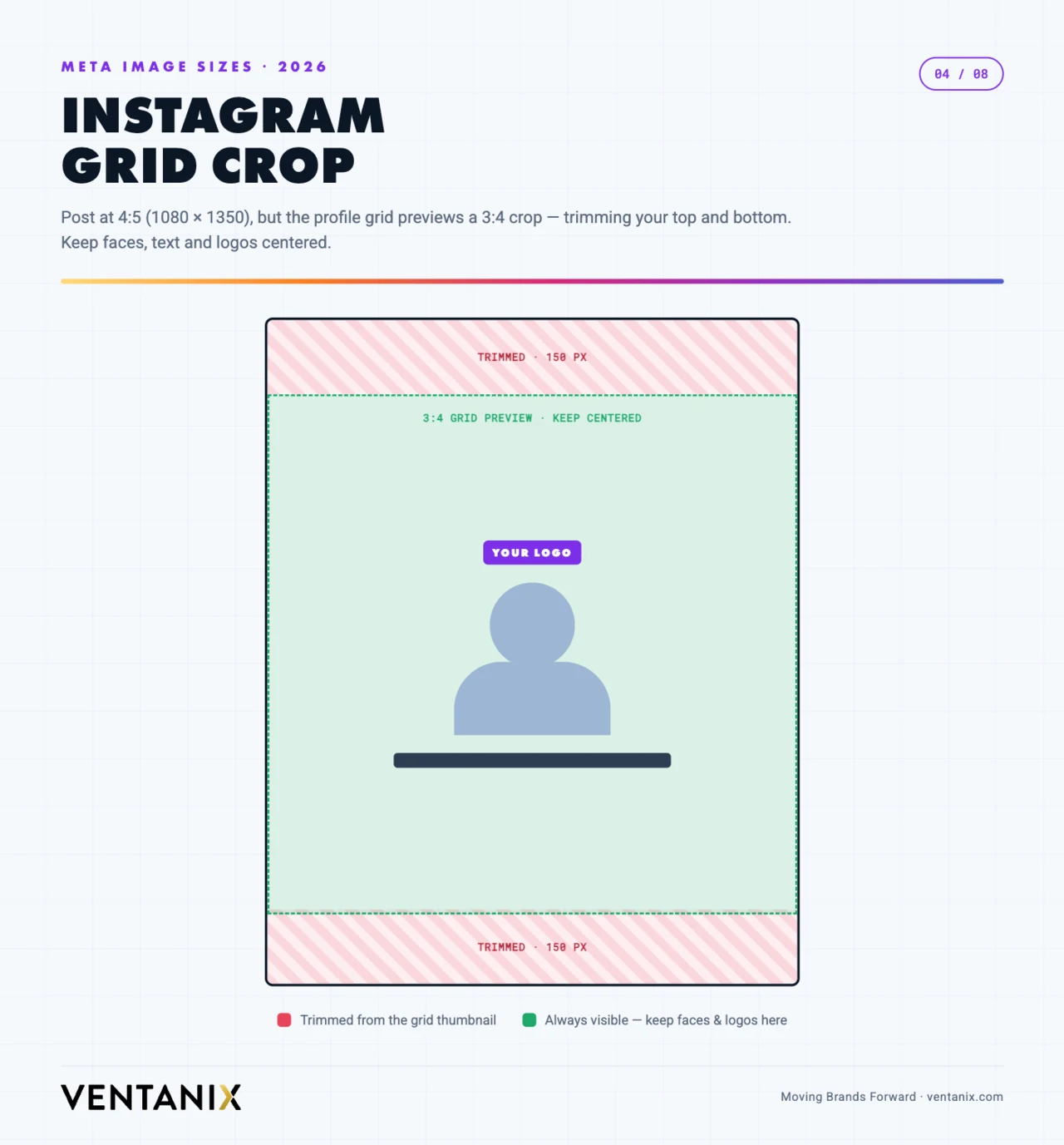
Instagram saw the biggest structural change. In early 2026 the profile grid moved to a 3:4 preview, and the platform now supports a native 3:4 (1080 × 1440) feed post that matches most phone camera defaults. The 4:5 portrait remains the safest bet for maximum feed height.
| Placement | Recommended size (px) | Aspect ratio |
|---|---|---|
| Profile picture | 320 × 320 | 1:1 (displays as circle) |
| Feed post — portrait | 1080 × 1350 | 4:5 |
| Feed post — 3:4 (new) | 1080 × 1440 | 3:4 |
| Feed post — square | 1080 × 1080 | 1:1 |
| Feed post — landscape | 1080 × 566 | 1.91:1 |
| Carousel (all slides match) | 1080 × 1350 or 1080 × 1080 | 4:5 or 1:1 |
| Profile grid thumbnail (preview) | 1080 × 1440 crop | 3:4 |
| Stories | 1080 × 1920 | 9:16 |
| Reels | 1080 × 1920 | 9:16 |
The 3:4 grid crop trap
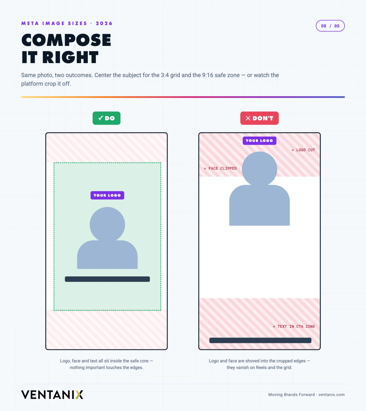
Even though the feed displays posts up to 4:5 tall, the profile grid now previews them at 3:4 — so the top and bottom slivers of a 4:5 image get trimmed in the grid view. Keep faces, text, and logos inside the central 3:4 area so they survive both the feed and the grid.
Carousels reward consistency: pick one ratio — usually 4:5 — and use it for every slide, because Instagram locks the whole carousel to the aspect ratio of the first image. Mixing a square and a portrait slide means the platform crops the odd ones out. For carousel covers, remember the first slide doubles as the grid thumbnail, so it takes the same 3:4 crop as any other post.
One more Instagram-specific habit worth keeping: fill in descriptive alt text on each feed image. It helps screen-reader users, gives Instagram’s system more context about the photo, and costs nothing. It is the on-platform equivalent of the alt attributes you would add to images on your website.
Meta Ads sizes and safe zones for 2026
For paid placements, Meta now recommends exporting at 1440px resolution so creative stays sharp on high-density screens — 1440 × 1440 for square and 1440 × 1800 for vertical. The older 1080px minimums still work, but they can show upscaling artifacts on newer devices.
| Placement | Recommended size (px) | Aspect ratio |
|---|---|---|
| Feed — square | 1440 × 1440 | 1:1 |
| Feed — vertical | 1440 × 1800 | 4:5 |
| Stories & Reels | 1080 × 1920 | 9:16 |
| Marketplace / Messenger | 1200 × 628 | 1.91:1 |
| Right column (desktop) | 254 × 133 | ~1.91:1 |
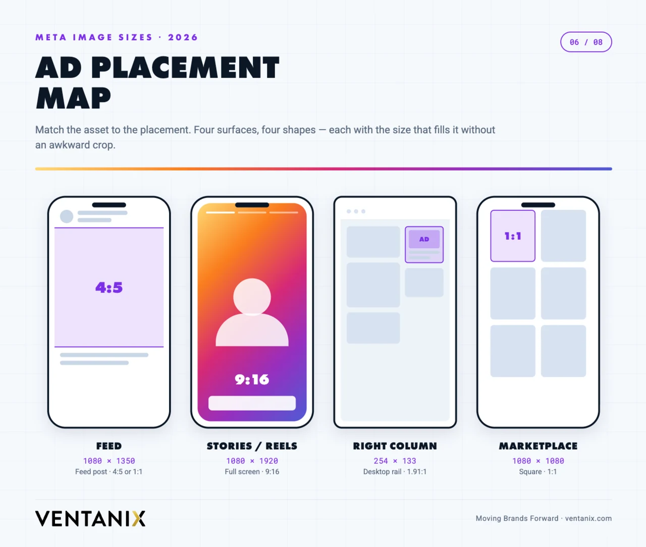
A few paid-only notes. The right-column placement is tiny and desktop-only, so never put readable copy inside that image — let the headline and description fields carry the message. If you use Advantage+ placements (Meta’s automatic placement option), supply both a 1:1 and a 9:16 asset so the system has a well-composed file for every surface instead of hard-cropping one shape to fit all of them. And while Meta dropped the old 20%-text rule as a hard rejection, heavy text overlays still suppress delivery — keep type light and let the image do the work.
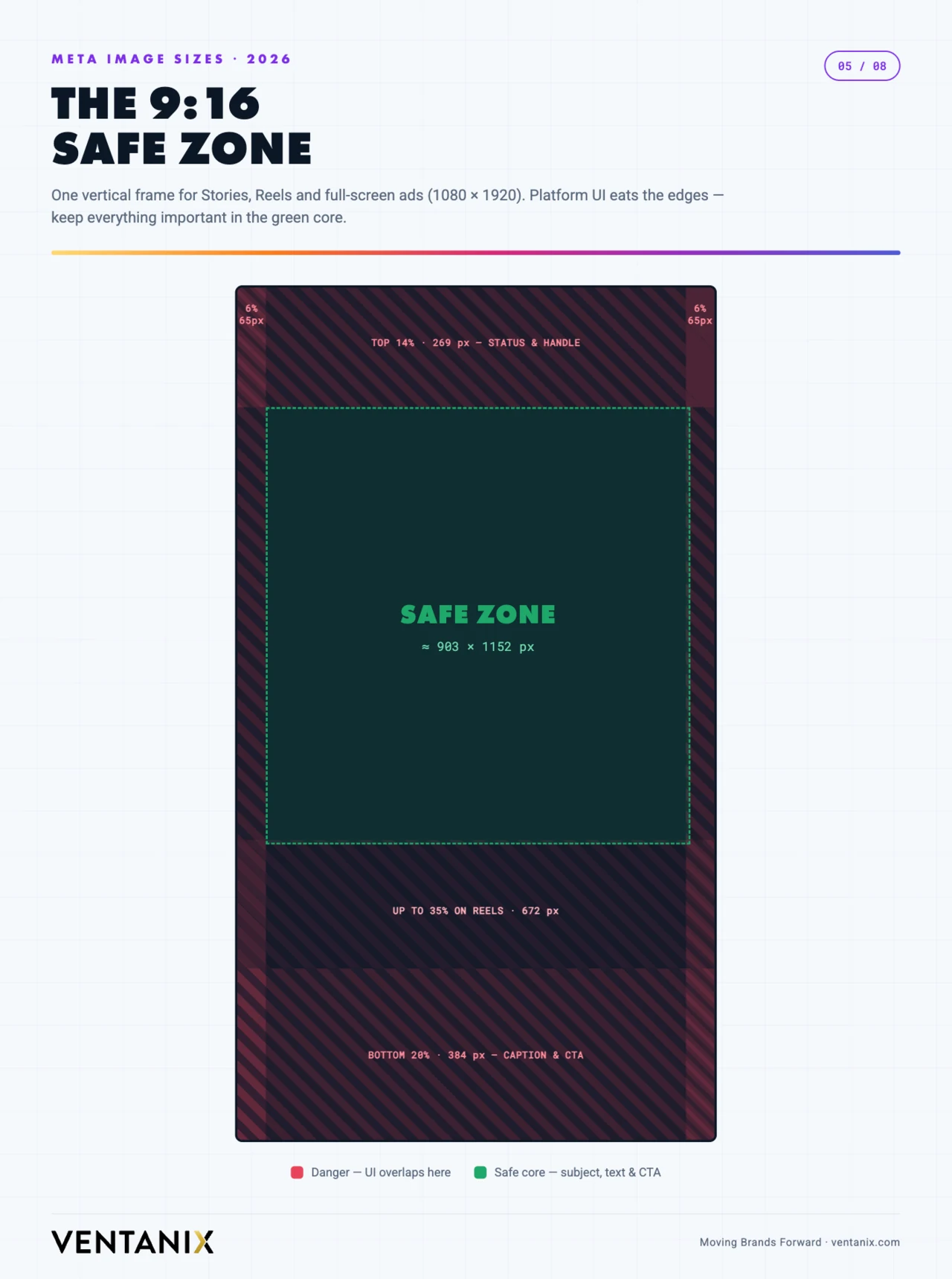
The unified 9:16 safe zone
As of 2026, Meta consolidated Facebook Stories, Facebook Reels, Instagram Stories, and Instagram Reels into a single 9:16 safe zone — so one correctly designed vertical asset now works across all four placements. On a 1080 × 1920 (or 1440 × 2560) canvas, keep critical elements clear of: the top ~14% (profile icon, username, “Sponsored” label), the bottom ~20–35% (CTA button, captions, engagement icons), and roughly 6% on each side for device-edge variance.
Video specs for Reels, Stories & feed video
Static image sizes only tell half the story — most of Meta’s growth surfaces are now video. The good news is that the pixel dimensions match the still-image sizes you already know; what changes is resolution, length, and file weight. Design video to the same 9:16 and 4:5 frames, then mind these specs:
| Placement | Resolution | Aspect ratio | Length | Max file size |
|---|---|---|---|---|
| Reels (Facebook & Instagram) | 1080 × 1920 | 9:16 | up to ~3 min | 4 GB |
| Stories (video) | 1080 × 1920 | 9:16 | up to 60 s per card | 4 GB |
| Feed video | 1080 × 1080 or 1080 × 1350 | 1:1 or 4:5 | up to ~60 min | 4 GB |
| In-stream / ad video | 1080 × 1080 or 1920 × 1080 | 1:1 or 16:9 | varies by placement | 4 GB |
Export video as MP4 or MOV using the H.264 codec with AAC audio, stereo, at 128 kbps or higher, and a frame rate of 30 fps. Upload the highest-quality file you can within the 4 GB ceiling — Meta re-compresses everything on ingest, so starting from a clean, high-bitrate source is the single biggest thing you can do to avoid a muddy final result. Add a cover frame at 1080 × 1920 for Reels; it becomes the grid thumbnail and gets the same 3:4 crop as a photo.
Knowing the specs is the easy part — consistently producing vertical video that’s worth watching is the hard part, and it’s where most businesses stall. If that’s the bottleneck rather than the pixel dimensions, it’s exactly what our video and photo production team does.
How meta post sizes compare to other social media
If you publish the same campaign across networks, it helps to see where Meta’s numbers line up with the rest of your social media stack and where they diverge. The vertical 9:16 and portrait 4:5 frames travel well; the landscape and profile sizes are where each platform goes its own way. Here is a quick cross-platform image-size comparison for the placements marketers reuse most:
| Platform & placement | Recommended size (px) | Aspect ratio |
|---|---|---|
| LinkedIn — feed / link image | 1200 × 627 | 1.91:1 |
| LinkedIn — square post | 1200 × 1200 | 1:1 |
| LinkedIn — company logo | 300 × 300 | 1:1 |
| X (Twitter) — in-stream image | 1600 × 900 | 16:9 |
| YouTube — video thumbnail | 1280 × 720 | 16:9 |
| Pinterest — standard Pin | 1000 × 1500 | 2:3 |
| TikTok — video | 1080 × 1920 | 9:16 |
The pattern is clear: LinkedIn still leans landscape (1.91:1) for link posts and square for native images, which is the opposite of Meta’s vertical-first feed. Pinterest wants an even taller 2:3 than Instagram’s 4:5. And the 9:16 vertical you built for Reels and Stories drops straight into TikTok with no changes. If you design a 9:16 master and a 1:1 master (more on that below), you already cover most of Meta, TikTok, and the square slots on other social media — you only need bespoke files for LinkedIn’s landscape link image and a 16:9 export for X and YouTube.
File size, format & compression: keep photos crisp
Getting the pixel dimensions right is only half of image quality. The other half is how you save the file. Meta re-encodes every photo you upload, so your job is to hand it a clean, correctly formatted source and let it do the least damage possible.
Format. Use JPG for photos and photographic content, PNG for graphics with flat color, sharp edges, or transparency (logos, text-heavy stills), and WebP when your tool supports it — WebP delivers PNG-level quality at a fraction of the file size and is accepted across Meta’s surfaces. For video, stick with MP4/MOV (H.264).
File size. Facebook and Instagram accept stills up to 30 MB and video up to 4 GB, but you rarely want to get near those limits. A well-compressed 1080 × 1350 JPG is usually well under 1 MB with no visible quality loss, uploads faster, and gives Meta’s compressor less to chew on. For shared link previews, keep the Open Graph image lean — a heavy OG file slows the preview from rendering.
The DPI myth. Screens render by pixels, not inches, so 72 DPI versus 300 DPI makes no difference to how a photo looks on Facebook or Instagram — only the pixel dimensions matter. Ignore the DPI field entirely for anything destined for a screen; a 1080 × 1350 image at any DPI is still 1080 × 1350 pixels.
Color and sharpness. Export in the sRGB color space; other profiles can look dull or shifted once Meta converts them. Size the image to the exact pixel dimensions above before you upload rather than letting the platform downscale a giant file — resizing in your design tool, where you control the sharpening, always beats Meta’s automatic downscale.
Common meta post size mistakes to avoid
Most cropped, blurry, or off-brand posts trace back to the same handful of errors. Scan this list before you export:
- Designing square by default. The 1:1 habit is hard to break, but 4:5 portrait is the 2026 workhorse — square leaves vertical space on the table in every feed.
- Ignoring the Instagram 3:4 grid crop. A 4:5 post that looks perfect in the feed can lose its top and bottom in the profile grid. Keep faces and text in the central 3:4 area.
- Putting text in the Story/Reel danger zones. The top ~14% and bottom ~20–35% are covered by UI. Copy placed there gets hidden behind the username or CTA button.
- Uploading one asset for every ad placement. A single 1:1 file forces Meta to hard-crop your Stories and Reels. Give it a 9:16 version too.
- Fixing a bad link preview on Facebook. The preview image comes from the destination page’s Open Graph tag (1200 × 630), not from anything you upload to Facebook.
- Mixing aspect ratios in a carousel. Instagram locks the whole carousel to the first slide’s ratio and crops the rest. Match every slide.
- Chasing DPI instead of pixels. Time spent setting 300 DPI is wasted for screens — only pixel dimensions matter.
A simpler workflow: design two masters
You don’t need a unique file for every placement. Build two reusable master assets and adapt from there: a 1:1 (1080 × 1080) master that covers Feed, Marketplace, Right Column, and Messenger, and a 9:16 (1080 × 1920) master that covers Stories, Reels, and Audience Network. With important content centered and inside the safe zones, those two files handle the overwhelming majority of what you’ll publish.
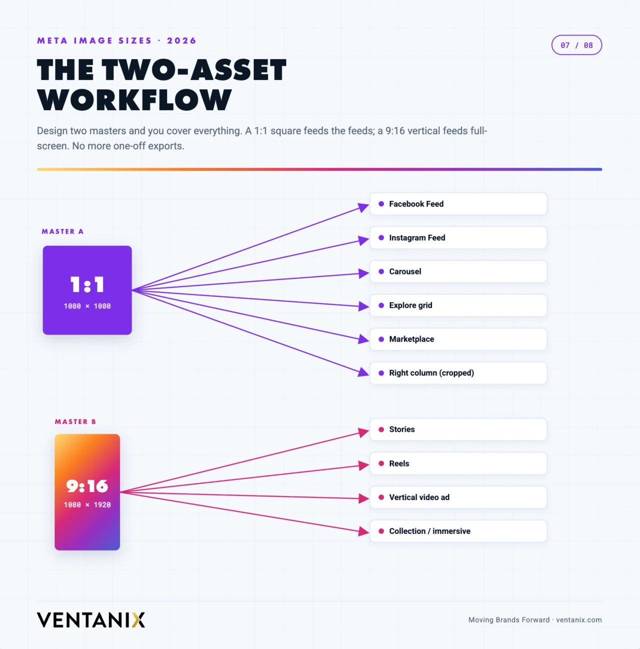
Set both masters up as artboards or frames in your design tool with the safe zones marked as guides, and name your exports by placement (for example campaign_feed_1x1.jpg and campaign_story_9x16.jpg) so the right file always lands in the right slot. When a 4:5 or 3:4 variant is needed, extend the 1:1 master’s background rather than starting over.
If those masters don’t exist yet, that’s the real job — and it’s a brand identity exercise, not a per-post one. Templates built once around your colours, type, and logo placement mean every future post is a five-minute export instead of a fresh design decision.
File specs to remember
Keep images under 30 MB and video under 4 GB. Use JPG, PNG, or WebP for stills and MP4 or MOV (H.264) for video. Export at the native pixel sizes above rather than letting Meta downscale a giant file — you’ll get cleaner results and faster uploads. And always work in sRGB so the colors you approve are the colors your audience sees.
A 30-second pre-publish checklist
Run every post through this quick check before it goes live:
- Is it built at one of the recommended pixel sizes — ideally 1080 × 1350 (feed) or 1080 × 1920 (Stories/Reels)?
- Are faces, logos, and text inside the safe zone for that placement — the central 3:4 for Instagram grid posts, clear of the top and bottom bands for vertical video?
- Is the file exported as JPG, PNG, or WebP in the sRGB color space, comfortably under the size limit?
- For ads, do you have both a 1:1 and a 9:16 version so Meta can fill every placement?
- For a shared link, does the destination page have a 1200 × 630 Open Graph image?
If you can tick all five, your creative will render sharp and uncropped everywhere it appears.
Meta post sizes: quick FAQ
Short answers to the meta post sizes questions we hear most from clients.
What is the best all-round meta post size for 2026?
1080 × 1350 (4:5 portrait). It takes the maximum vertical space a feed post is allowed on both Facebook and Instagram, and it survives the Instagram 3:4 grid crop as long as you keep key content centered.
What size are Facebook and Instagram Stories and Reels?
1080 × 1920 pixels at a 9:16 aspect ratio. Since Meta unified the four surfaces in 2026, one 9:16 asset works for Facebook Stories, Facebook Reels, Instagram Stories, and Instagram Reels.
What is the new Instagram 3:4 size?
1080 × 1440 pixels. Instagram’s profile grid now previews posts at 3:4, and the platform supports native 3:4 feed posts that match most phone cameras.
What is the recommended Meta Ads image size?
1440 × 1440 for square and 1440 × 1800 for vertical. Meta recommends the higher 1440px resolution in 2026 for sharpness on high-density screens; the 1080px minimums still work.
What is the maximum file size for a Meta post?
Up to 30 MB for a still image and 4 GB for video — but aim far lower. A well-compressed JPG or WebP feed image is usually under 1 MB with no visible quality loss.
Does image DPI matter for Facebook or Instagram?
No. Screens render by pixels, so 72 versus 300 DPI is irrelevant on social media. Only the pixel dimensions listed above affect how your photo looks.
What size is a Facebook cover photo in 2026?
Upload at 820 × 312 pixels. Facebook crops it to roughly 640 × 360 on mobile, so keep your logo and headline within the shared central area that survives both the desktop and mobile crop.
What is the best image format for Facebook and Instagram posts?
JPG for photos, PNG for graphics with flat color or transparency, and WebP when your tool supports it — WebP gives you PNG-level quality at a much smaller file size, which uploads faster and compresses better.
Is one 9:16 file really enough for all Stories and Reels?
Yes. Meta unified Facebook Stories, Facebook Reels, Instagram Stories, and Instagram Reels into a single 9:16 safe zone in 2026, so one well-composed 1080 × 1920 asset works across all four placements.
What size should a Meta carousel be?
Pick one ratio — usually 4:5 (1080 × 1350) or 1:1 (1080 × 1080) — and use it for every slide. Instagram locks the carousel to the first slide’s aspect ratio and crops any slide that doesn’t match.
Final word
The throughline for 2026 is vertical and mobile-first: taller posts, a 3:4 grid, and a single unified 9:16 safe zone for Stories and Reels. Get your meta post sizes right at the template level — set 4:5 and 9:16 as the defaults, center your key content, export clean sRGB files at native resolution — and you’ll stay sharp across every Facebook and Instagram surface this year.
And if the sizes were never really the problem — if the honest issue is that nobody has the time to design, schedule, and actually run the campaigns — that’s the part we handle. Ventanix builds the templates, produces the creative, and runs Meta and paid social advertising for businesses that would rather be doing their actual job. Book a free strategy session and we’ll tell you straight whether it’s worth it.