
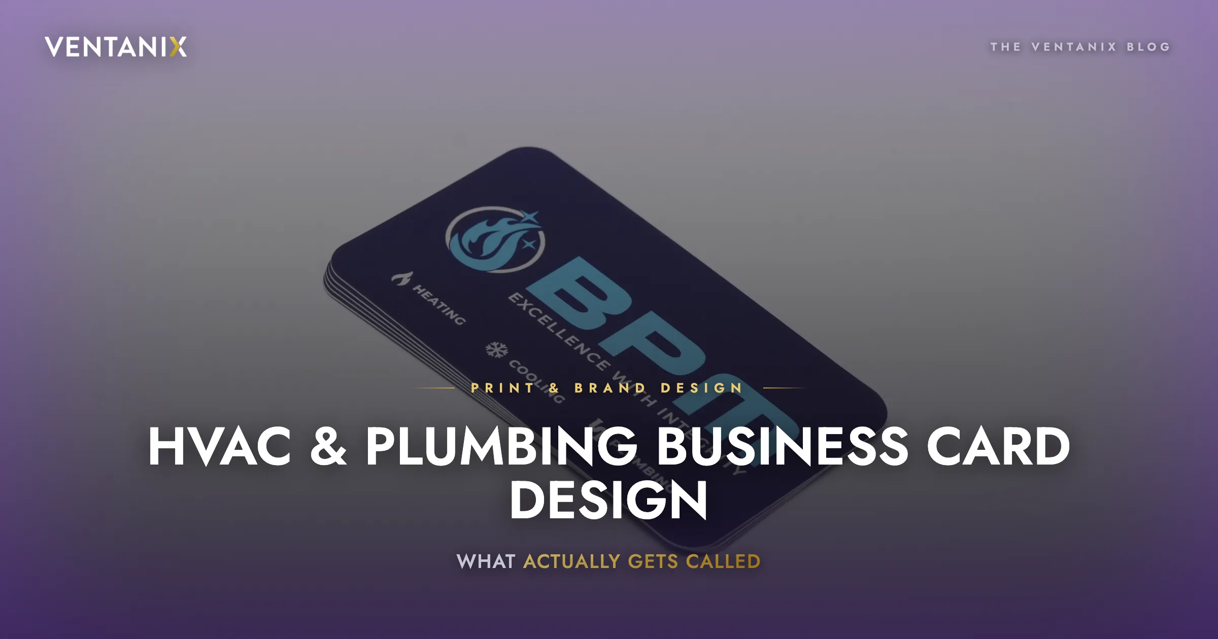
A homeowner’s furnace dies at 9 p.m. in February. They are not opening a browser and comparing five contractors. They are opening the junk drawer, or looking at the fridge, or calling whoever’s card is still sitting on the counter from the last time somebody was out.
That is the entire job of an HVAC business card. Not to look expensive. To survive long enough to be there when the emergency shows up.
Most don’t. They go in the drawer, get buried, and get tossed the next time the drawer gets cleaned. Below is what separates the cards that stay from the cards that don’t — pulled from the print work we do for heating, cooling, and plumbing contractors.
Why HVAC business cards are different from everybody else’s
A consultant’s card gets handed across a table. It has one job: to be a placeholder until the follow-up email.
An HVAC card gets left behind. It sits on a counter, gets stuck to a fridge, gets shoved in a truck’s glovebox, gets handed to a neighbor. Its lifespan is measured in months or years, not days, and the moment it finally matters is the moment somebody is stressed and cold and not reading carefully.
That changes the design brief in three concrete ways:
- It has to be physically durable. A thin card that lives on a counter for eight months looks like garbage by the time it’s needed. Soft-touch or matte laminate over a heavy stock survives; a 14pt gloss card with no coating does not.
- The phone number has to be readable at arm’s length, in a hurry. Not centered in a block of six other lines of the same size.
- It has to say which of your services applies. Homeowners genuinely do not know that the company who installed their AC also does water heaters. If it isn’t on the card, you don’t get the call.
The stock and finish: where most contractors under-spend
The single biggest visible difference between a card that reads as established company and one that reads as guy with a truck is the paper.
What works for home services:
| Element | Recommendation | Why |
|---|---|---|
| Weight | 16pt minimum, 18–32pt preferred | Survives a glovebox and a junk drawer |
| Coating | Soft-touch (suede) laminate | Fingerprint-resistant, doesn’t scuff, signals quality on contact |
| Edges | Rounded corners (optional) | Corners are the first thing to fray on a card that gets handled |
| Color edge | Optional painted edge | Expensive-looking; only worth it if brand is already tight |
Soft-touch is the one we push hardest. It costs marginally more per thousand and it is the finish people physically notice — they run a thumb across it. On a $9,000 system replacement, the card that felt like a real company is not a rounding error.
Where you should not spend: foil, spot UV on the whole face, or anything that fights legibility for the sake of looking premium. If the phone number is hard to read, the finish was a waste.
The layout: one hierarchy, three levels
Every good home-services card resolves to the same three-level hierarchy. Level one is what a person sees from across a kitchen. Level three is what they read when they’ve already decided to call.
Level 1 — Who you are. Company name or logo, large, high contrast. This is what the eye lands on. On the BPM card in the photo above, the mark occupies a genuinely aggressive share of the face — and it works, because it’s what makes the card recognizable in a drawer six months later.
Level 2 — What you do. The services, stated plainly. HEATING · COOLING · PLUMBING. Not “comfort solutions.” Not “residential mechanical services.” The words a homeowner would actually type. On the BPM card these run vertically along the edge with small icons — a snowflake for cooling, a pipe mark for plumbing — which does two things at once: it makes the list scannable for someone who doesn’t read English fluently, and it fills a dead edge with information instead of decoration.
Level 3 — How to reach you. Phone number, first and biggest. Website second. Email third, if at all — nobody emails an HVAC company during an emergency. License number if your state requires it (and even if it doesn’t, it builds trust).
The one line most contractors leave off
A tagline that says something.
“Excellence with Integrity” on the BPM card is doing real work. It’s not a slogan for the sake of a slogan — for a trade where the customer’s genuine fear is getting ripped off by a guy in a truck, the word integrity is the objection-handler. It’s on the card because it answers the question the homeowner is actually asking.
Most HVAC cards either skip the tagline or fill it with something that means nothing: “Your Comfort Is Our Priority.” Ask what fear that addresses. If the answer is none, the line is decoration.
Good taglines for the trades tend to hit one of four anxieties:
- Trust / honest pricing — “Excellence with Integrity,” “Straight answers, fair prices”
- Speed — “24/7. Really.”
- Longevity — “Serving Frederick County since 1994”
- Competence — “NATE-certified technicians”
Pick the one your reviews already say about you. That’s usually the honest answer.
What to put on the back
The back of the card is free real estate and most contractors waste it. Options, roughly in order of how well they perform for home services:
- A maintenance reminder / service-date box. A blank line for “Next service due: ______” written in by the tech. This is the single highest-value use of the back, because it converts the card from a business card into a reminder, and reminders get kept.
- A QR code to book online. Only worth it if the destination is a real booking page, not your homepage. A QR to a homepage is a QR to nowhere.
- A short offer. “$79 diagnostic — mention this card.” Trackable, and it gives the homeowner a reason not to throw it away.
- A service checklist. The full list of what you do, since the front only has room for the top three.
What not to put on the back: a stock photo of a smiling technician, a mission statement, or nothing at all.
Common mistakes we see in HVAC card design
- Too many phone numbers. Office, emergency, cell, fax. Pick one. Two if you truly have a separate emergency line, and label it clearly.
- A logo that only works in color. Your card is one thing; it also has to survive a truck wrap, a yard sign, an invoice, and a one-color embroidered polo. If the logo dies in single-color, the logo is a problem — and it will cost you every time you print anything.
- Ignoring the service area. “Serving Frederick & Montgomery County” tells a homeowner in thirty seconds whether to bother calling.
- Text to the trim edge. Anything within 1/8″ of the cut is a gamble. Keep the phone number well inside the safe area.
- No license number. In most states it’s required on advertising anyway, and it’s free credibility.
The spec sheet
If you’re briefing a printer tomorrow, this is the short version:
- Size: 3.5″ × 2″ (standard) — don’t get clever, non-standard cards don’t fit wallets or cardholders
- Stock: 16pt minimum, 18pt+ preferred
- Finish: Soft-touch laminate, both sides
- Bleed: 0.125″ all around
- Safe area: 0.125″ inside trim
- Color: CMYK, and confirm your brand blue converts cleanly — bright blues are the most common casualty of RGB-to-CMYK conversion, and HVAC brands are full of bright blues
- Front: Logo, service list, phone
- Back: Service-date box or booking QR
Get it right once
A business card is the cheapest brand asset you’ll ever produce and the one that gets handled the most. It’s also the one that exposes an inconsistent brand fastest — if the card, the truck, and the invoice don’t look like the same company, homeowners notice, even if they couldn’t tell you why.
We design and print for HVAC, plumbing, and home-service companies — cards, wraps, yard signs, and the brand system that keeps them consistent. If you want a look at what your current card is doing wrong, send it over and we’ll tell you straight.